

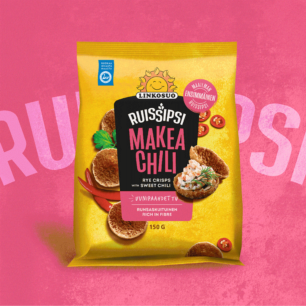
New sunny packaging for Linkosuo Ruissipsi
Linkosuo Ruissipsi is a versatile classic of the crispbread shelf – a feel-good snack perfect for both everyday moments and celebrations. Natural, Finnish ingredients combined with clever and bold thinking have earned Ruissipsi its rightful place as the market leader. When it was time for the brand to shed its old skin, we were proud to be involved. The goal was to update the packaging to better reflect Linkosuo’s sunny brand, which had recently undergone a thorough development process. At the same time, the aim was to strengthen shelf presence and make the packaging even more appetizing and appealing.
True to the brand’s character, the result was a bold leap forward: sunny, colorful, and clear packaging that reflects the brand’s cheerful, open-minded, and confident attitude.

From zero-waste treat to snack-time classic
Linkosuo Ruissipsi has a rich history and great origin story: the first rye snacks were created from a desire to reduce waste by using the small, round center pieces left over from baking traditional rye flatbreads. Ruissipsi is the now-classic, irresistibly crunchy descendant of those zero-waste bites – a true all-rounder in the world of snacks, perfect enjoyed as-is, dipped, filled, on weekdays or at parties.


The packaging look also highlights the product’s versatility for different occasions and uses. The cup-like shape of Linkosuo Ruissipsi, perfect for filling, was showcased in a mouthwatering serving suggestion image. On the back of the package, pictograms communicate at a glance the many tasty ways the product can be enjoyed.

Sunny packaging for a sunny brand
One of the key goals of the redesign was to strengthen the consistency of the Linkosuo Ruissipsi brand. At the same time, it was essential to maintain clear distinction not only between flavors but also between Ruissipsi and its lighter cousin, the oat snack Kaurasipsi. Various options were explored, but the final solution was found at the heart of the brand: Ruissipsi and Kaurasipsi were dressed in Linkosuo’s brand colors—yellow and orange. These colors, deeply rooted in the Linkosuo identity, reinforce shelf presence by creating a cohesive brand block amid a colorful shelf landscape, making both snack variants easier to spot.

Despite a unified overall look, product-specific differences were preserved. The familiar flavor colors from the previous design were carried over and placed more prominently next to the product name. This makes shelf navigation and finding your favorite flavor quick and intuitive.
The Ruissipsi brand refresh is a textbook example of how even major changes can be purposeful. Enhanced packaging communication supports purchasing decisions and inspires trial. The new design conveys a sense of a well-managed, up-to-date brand that confidently claims its place in a constantly evolving competitive environment.


