


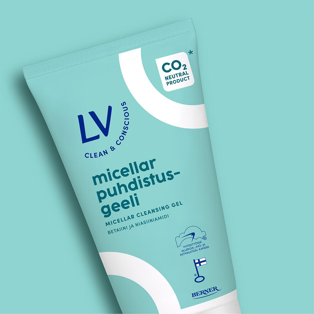
Packaging design for a pioneer in responsible reduction
LV, a brand by the Finnish family company Berner established over 50 years ago, has long championed the cause of “less is more.” Fragrance- and colorant-free products are gentler not only on skin but also on the environment. Now the brand has taken its commitment to sustainability even further with the development of a new line of Reinforcing Facial Care products —the result of ambitious, long-term development work. The product line represents the science of reduction: minimized carbon footprint, fewer ingredients, and a full third-party life cycle assessment (LCA) and carbon footprint analysis.
LV’s slogan, “Less is just right,” has never been more accurate, and as LV’s packaging design partner, we were honored to help make that message visible on the packaging as well.
– When you have a trusted, long-term partner who knows the brand inside out, development work becomes true collaboration: conversational, exploratory, inspiring, and fun. A partner’s fresh perspective on the brand also opens your own eyes to new possibilities. The journey is always interesting—where we start and where we end up.
Sanni Väinölä, Brand manager, Berner Oy

Packaging design with continuity and minimalism
A key goal of the design work was to seamlessly integrate this ambitious new product line into LV’s established visual brand story. The packaging needed to feel new and distinctive at first glance—yet remain true to the brand. LV is a science-based, research-driven brand, and the minimalist ethos of the new line—fewer ingredients, a smaller carbon footprint, and reduced energy consumption—needed to come across visually as environmentally friendly, but without over-emphasizing greenness.
The final visual concept was built around a simplified version of LV’s signature curve. Representing continuity and renewal, this shape now also symbolizes circularity and ongoing development. The new look allows for an expressive and elegant visual identity with minimal elements. One of the biggest visual changes is the color scheme: instead of LV’s signature white, the packaging now features a calm yet intense turquoise as the main color. It fits the brand perfectly yet clearly distinguishes the new product line on the shelf.

A constant challenge in packaging design is to achieve simplicity and impact while still communicating all the product’s key features. The LV Reinforcing products have a great deal worth sharing—from cold blending and renewable energy to a minimized and compensated carbon footprint and thoughtful packaging choices. Together with the client, we carefully selected the most essential claims to feature on the packaging and eliminated any unnecessary noise—then tested the final design and messaging with consumers to ensure it resonated.


